Module 2 allowed for insight into a greater variety of multimedia education. This time I was able to use knowledge from the past module and incorporate it into my learning here. I enjoyed actually using the skills in real time to further expand my understanding as well as was able to create a well laid out infographic through Canva that I was proud of.
I enjoyed educating myself further on the accessibility of design as it is an important concept to know and understand. I feel as if before I had a broad knowledge but had not thought of the full affects on how multimedia practices need to be more inclusive. Going forward that knowledge will be useful in my practice of both work and school so that I have awareness and inclusivity can be a top priority.
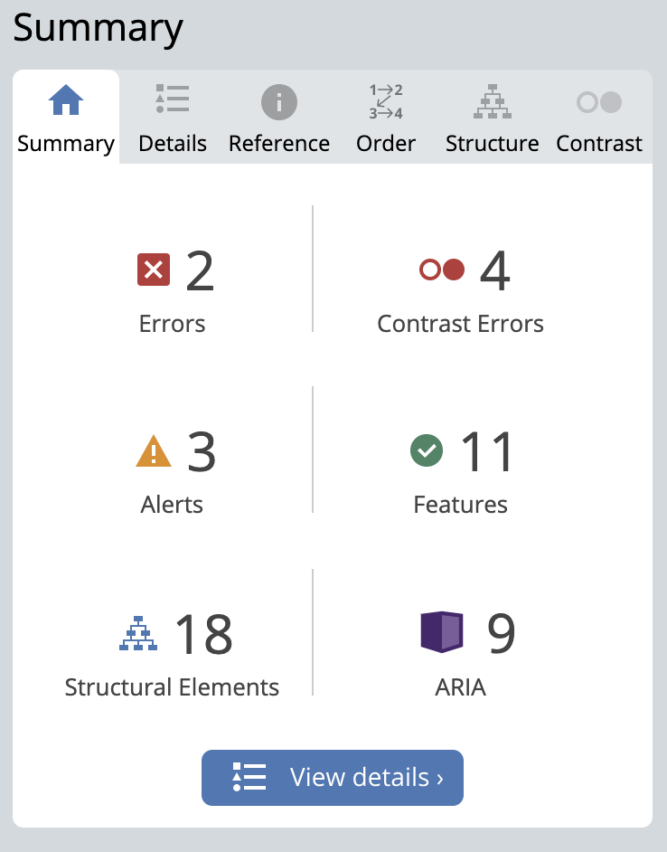
What did you find when you ran the WAVE accessibility report on your blog post(s)? What did you expect and what was surprising? Is there anything you will do differently going forward?
The WAVE accessibility report was a great tool for a more in depth look into my website. I was not sure what to expect from the repot but it was interesting to see. I had 2 errors, 4 contrast errors, 3 alerts, 11 features, 18 structural elements and 8 ARIA. I went forward with finding where the 2 errors I had were first. Both of these errors I believe were technical error. The first flagged an empty button which was the drop down menus, which when actually using the site properly functions. The second error came from an empty header. I believe in the creation of the post I had accidentally created another section and left it blank. That is something I will be more mindful of going forward as I believe my assumption was it was just deleted if not used.


The contrast errors were something I would have never thought of before. The 4 that were shown to me made complete sense as the colours were not easy to see. It was interesting to do the WAVE report and I feel it was quite beneficial to my learning now and going forward with designs.
Have you used Text to Speech tools before? Did you find it useful? Did you try out some of the different voices? What impact did the different voices have on your ability to absorb information?
The Text to Speech extension I chose to download to test for this module was Read Aloud. I have not had much previous experience with Text to Speech tools prior so to try it in this module was interesting. Previously I have used audible to read books which is a version of Text to Speech, yet not as similar to Read Aloud. I tried it on my module 1 as well as a few other websites I was using in other classes. It was fun to play around with the voice options as there were multiple languages as well as accents. I found the basic voice it started with did not catch my attention and made it hard to absorb the information. I landed on actually enjoying the women Irish accented English speaker and found the tone was less robot and easy to understand. I will definitely keep this extension on my computer for the future as I learn better through hearing rather than reading.
What does inclusive design mean to you?
Inclusive design is not just one definition but has a range of pieces that help to build it up. I believe that users need to be looked at in top priority when designing. For example, it must be accessible and inclusive. There needs to be an emphasis on users needs, whether that includes visual or hearing impairment or mobility needs. Including accessible buttons, text to speech features, captions are just a few ways this can be done. A design that showcases diversity is important because it showcases representation and allows for growth in learning. These features all work together to build up inclusive design and it is important to recognize that!
What do you think the presentations in The World’s Worst Powerpoint Presentations have in common? Which design principles and which other principles (Mayer’s, Inclusive Design, UDL) are they missing?
The presentations in The Worlds Worst Powerpoint Presentations were quite sore on the eyes. Instantly as I scrolled through the page I noticed each one was overfilled with information, no proper design aspect or formatting of any type. If looking at it in terms of Mayers principles I would say they are all lacking redundancy as well as the coherence principle. The Endless “Summary” one was not a PowerPoint that was well thought out at all. Just looking at it you get an overload of information, opposite of what the redundancy principle recommends. It did not seem like it had any inclusivity for those who may be visually impaired either. The social networking PowerPoint lacked diversity and the arrows did not allow for it to seamlessly flow in any way. It was a funny way to portray how you need to be aware of design principles when creating a multimedia piece and it will sit with me going forward after seeing that.
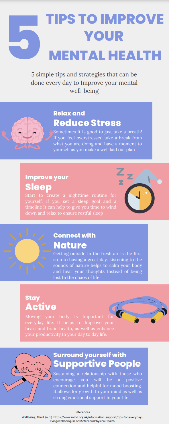
Which design principles did you use to create your infographic in Canva? Which elements of a ‘good infographic’ were you able to incorporate? What other principles did you consider? What does the template make easier and what does it make harder when creating your infographic?
When creating my infographic I focused on making sure that there was a simple layout, with bright colours (not to many colours however), and simple pictures that connected with the text well. The design principles I felt that I incorporated included balance, repetition, alignment and leaving negative space. The balance, alignment and repetition can be seen with the colour blocks that go around the words. The are eye catching, however you can easily navigate the flow of reading based on the spacing. Each one is the same size and the fonts stay relatively the same through each one. I left negative space around the edges to ensure that the 5 blocks were the main focus of attention. It was helpful to have the Canva templates for a starting point as it gave me an idea and I was able to work from there. The one problem with the templates is they tend to be very busy in terms of colours and lack of negative space so adjusting them to fit the design principles is important. I tried to incorporate a level of contrast in the infographic, something that my WAVE report had brought to my attention in my first post, and it was interesting to focus on that principle as I do tend to forget about it sometimes. In my screencast in Module 1 I had shared how to make an infographic through Canva so it was cool to actually incorporate the skills I had shared in that video.
To ensure that there is inclusivity in my infographic for those who are visually impaired in the future I would hope to incorporate a text to speech feature or voice over the infographic myself. This would include description of colours used as well as highlighting the headings that are shown. I believe that learning should be accessible to everyone and understanding peoples accessibility needs and differences is important for that.
Mayer’s 12 Principles of Multimedia Learning. Digital Learning Institute. (2023, June 2). https://www.digitallearninginstitute.com/blog/mayers-principles-multimedia-learning/
13 October 2023 at 12:01 am
Hi Skye,
I really enjoyed your module 2 post. After reading your reflection about the amendments you made to your site because of the WAVE report, I realized that I had actually noticed these two issues. When I clicked on your site today, I instinctively felt as thought it was easier to navigate. It is so interesting how well the WAVE report worked and how my subconscious felt about the site. Additionally, I am intrigued that you liked the Irish voice for the speech-to-text! I wonder why that is. Do you have friends or family with that accent? I also felt that the World’s Worse PowerPoints were a great way learn what NOT to do!
Your infographic looks awesome! I love how you took the advice of your WAVE report and used contrasting colors (red and blue). Your infographic also used the segmenting principle by having the topic ordered into a step-by-step process. I also appreciated that your infographic was simple and did not overwhelm my cognitive load. I liked that you used images and text, displaying the dual-coding theory. You also abided by the eight rules of infographics for example leaving negative spaces and having balance.
Thank you so much for sharing,
Maya